Capiton 2 is the continuation of the work started in Capiton 1. With Minh Man Nguyen assisted by Ludovic Haensen, we decided to pursue the research in a more systematic way. This time we wanted to address the question of scale, to establish a better understanding of influence of the surface deviation of Glass pane on transparency. This work was done in 2009.
- What range of optical distortion, relative to scale of deformation ? How does it affect the perception of the glass ?
- How does it affect the transparency ? When does the slight distortion become a real constrain to see through ?
- What kind of caustics, does it generates?
- Does it express better the materiality of the glass ?
- Is there some functional use to an essentially plastic research ?
Methodology:
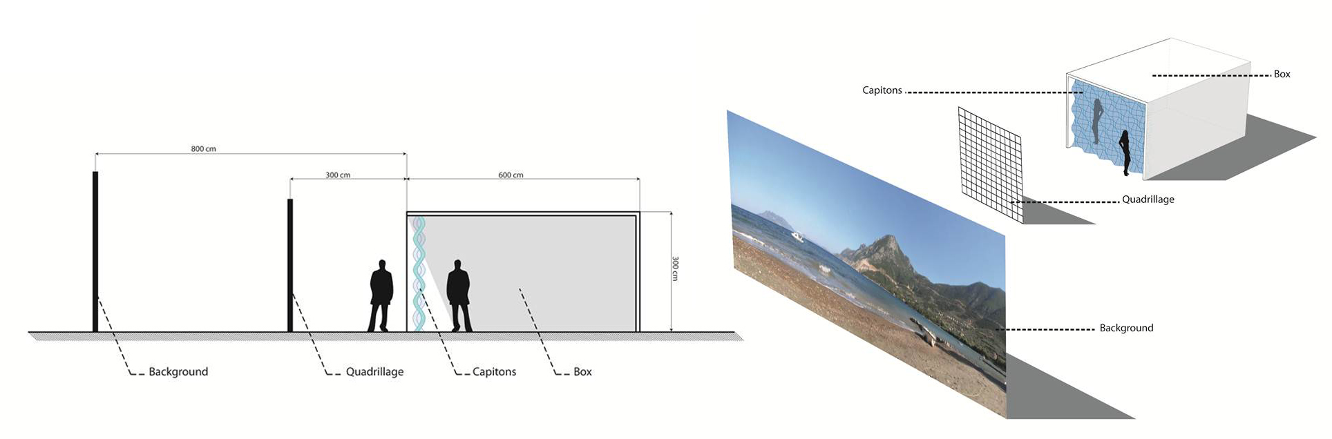
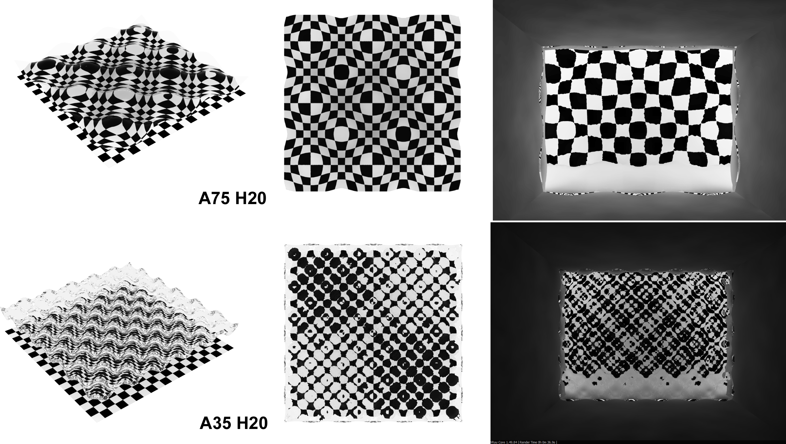
In order to have some kind of reference to compare test results, we used a bench mark. It was very similar to the “timescape room”, a generic box facing south with a beach as a landscape. The opening was quite big 3 by 6 meter or 4 x 5 m .
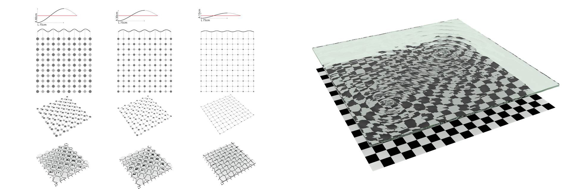
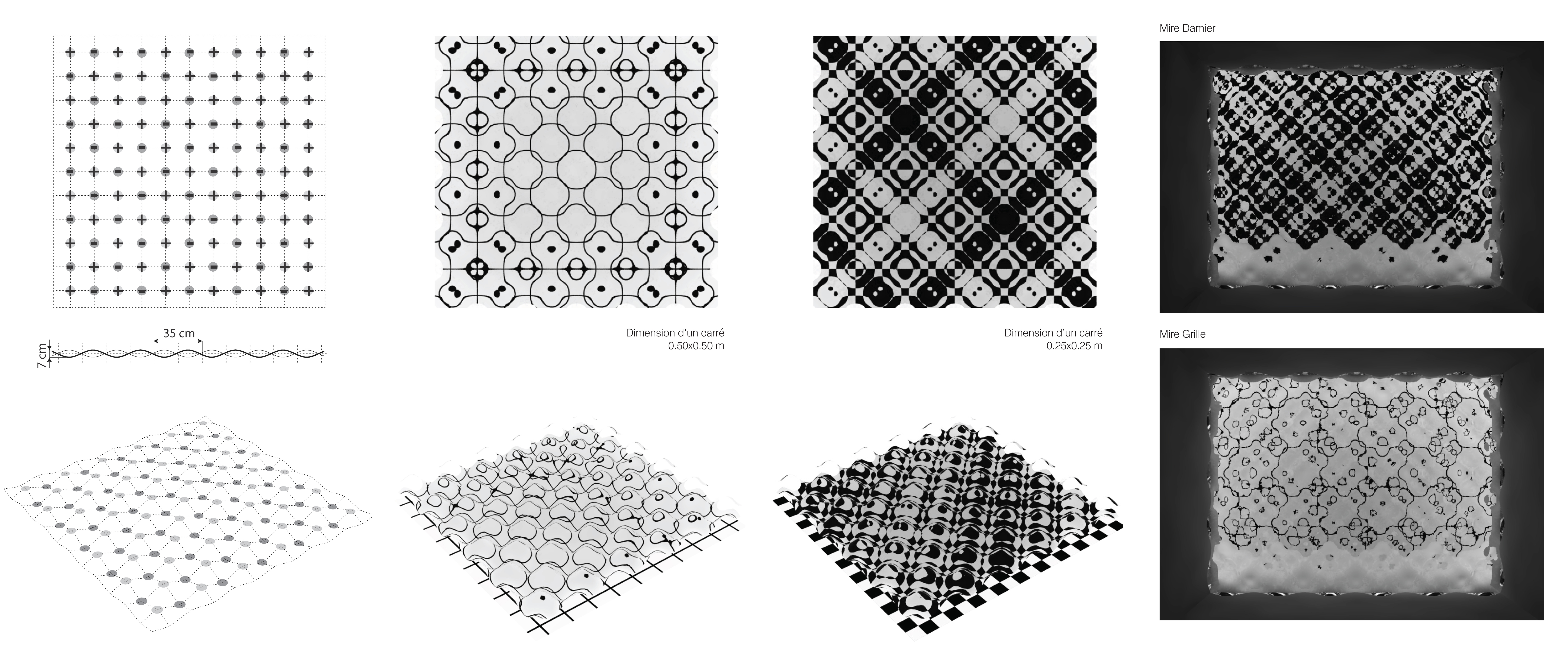
For the glass, we decide to use the “capiton” pattern, because the amplitude and height of the “bump” were fully controllable parametrically with simple scripts.
Very fast, we found difficult to apprehend the glass with digital means, because being transparent it was quite difficult to actually see the glass on the screen, and turning it into a fully reflective surface or opaque, was too much of the shortcut.
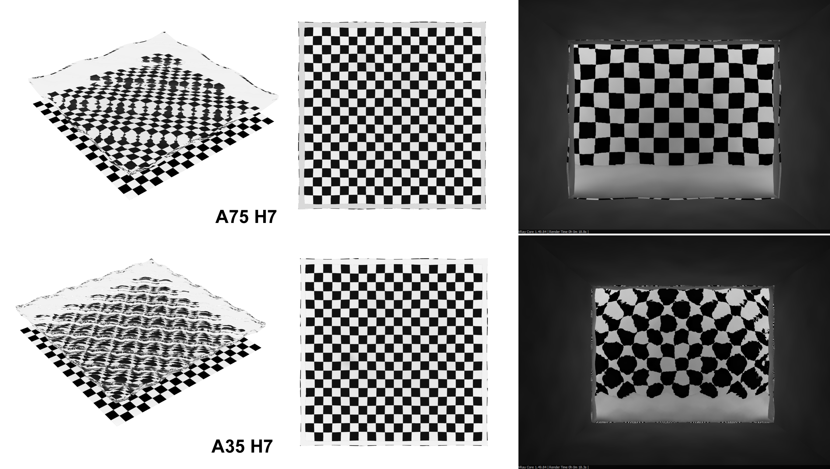
So we decided to try to characterize the patterns we obtained by a 2d representation of the pattern and then to overlay each piece, on a checker board or grid of lines, to enhance the distortion. (which is a standard practice in the industry to define the optic quality of glass.)
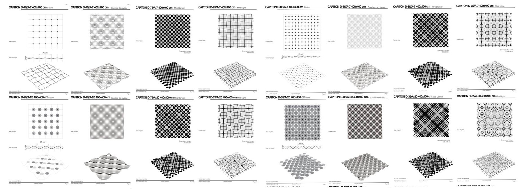
It isn’t very worth to go through all the characterization of the pattern but we discovered a few things, not really ground breaking since most of this results are quite logic. It helped us a defined the specific height and amplitude to when a surface become too distorted to keep an understanding of what is behind.
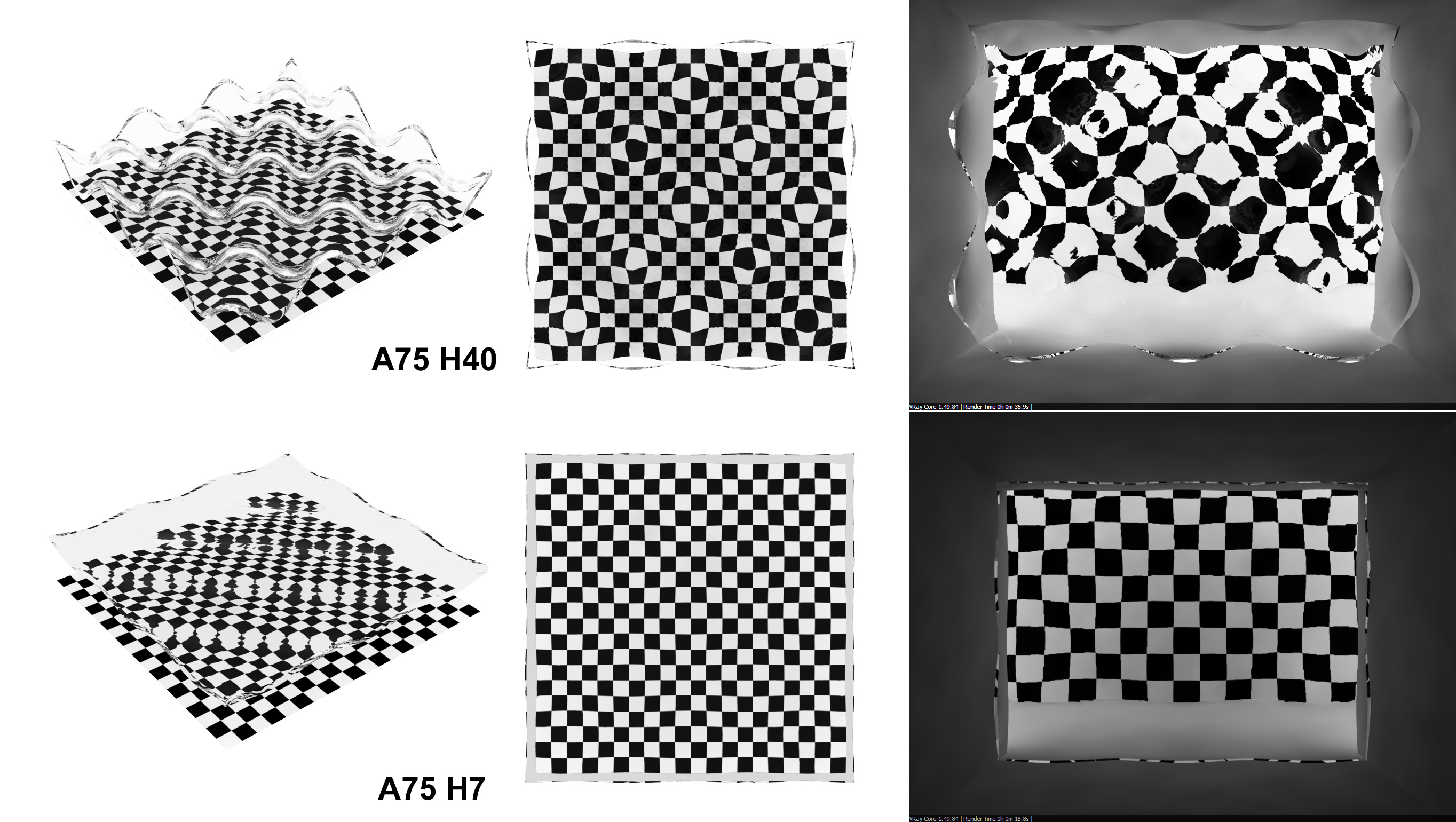
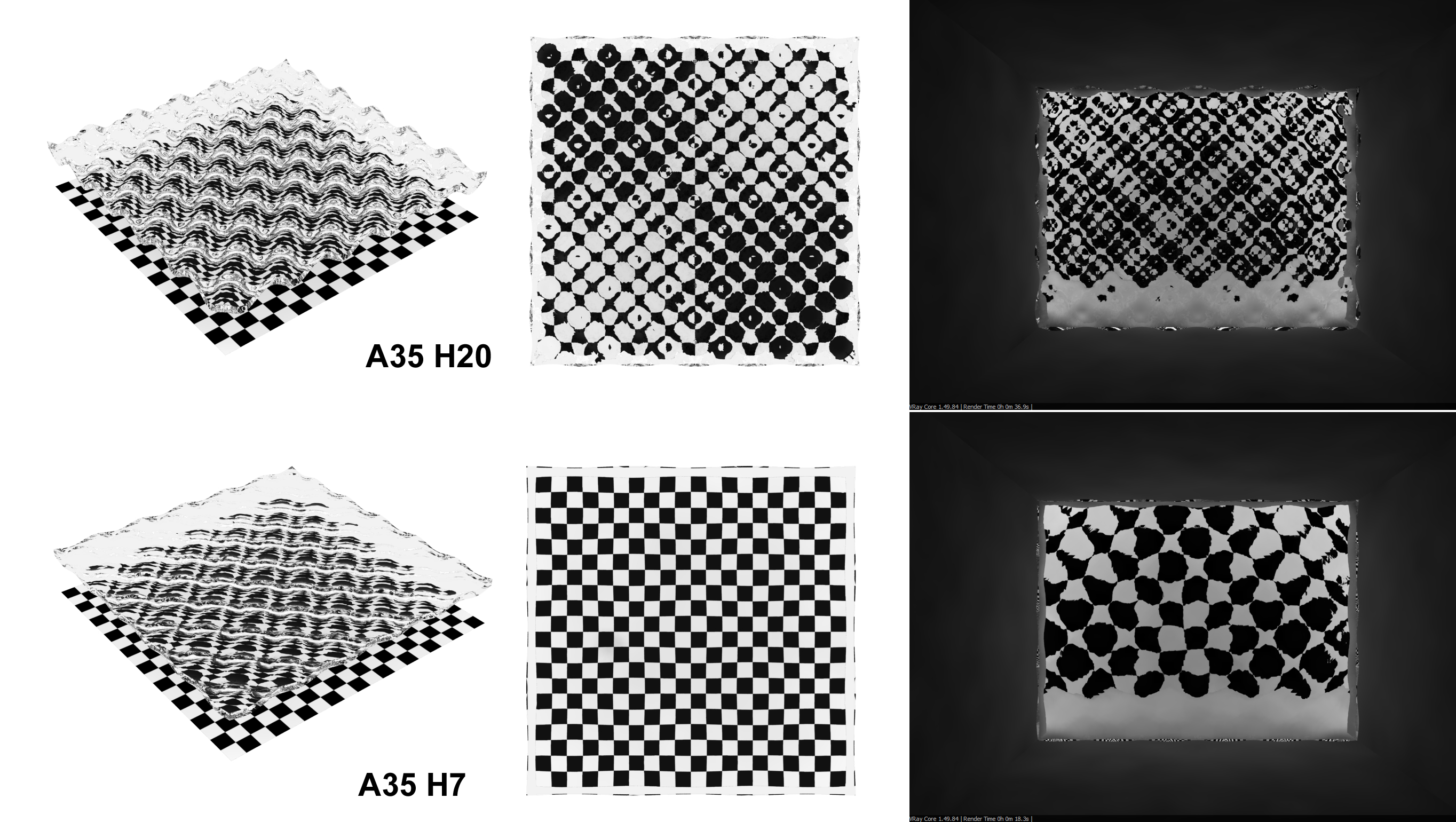
Although everything was transparent, the level of distortion of the surface sets what we would be able to see through or not, to keep a recognizable view or get an abstract distorted representation what is behind the glass pane.
In a way, by fine tuning the level of distortion of the patterned glass, it possible to keep or not a level of privacy from a viewer outside. Most of the images speak for themselves regarding the influence deformation of the glass to the level of transparency.
The second finding was that this combination of graphics with curved texture had also a very strong design potential.
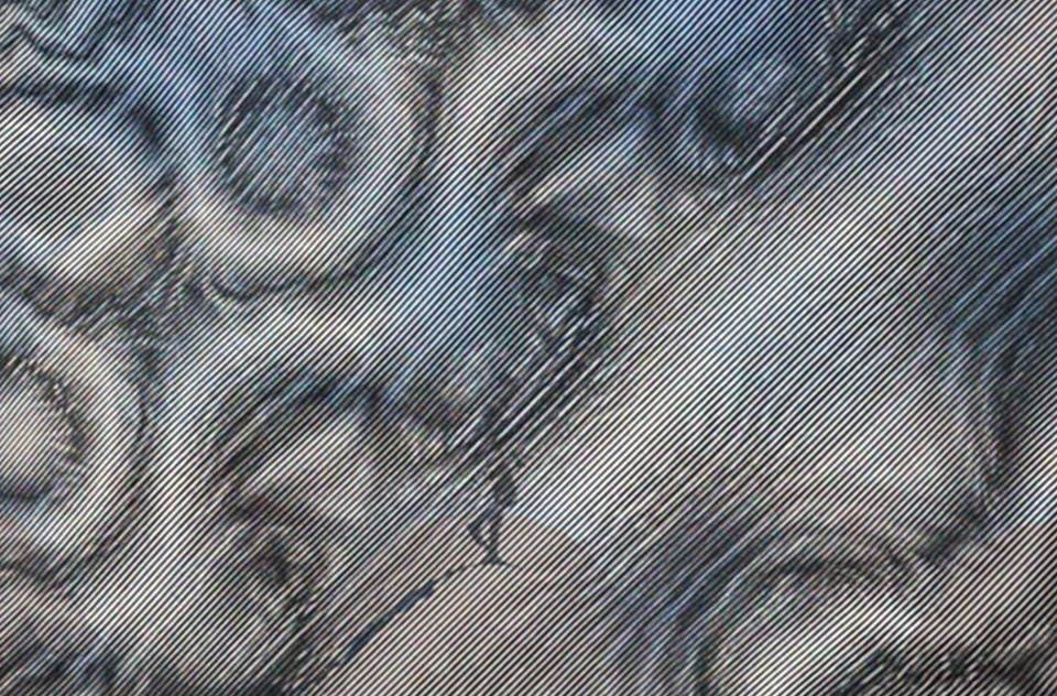
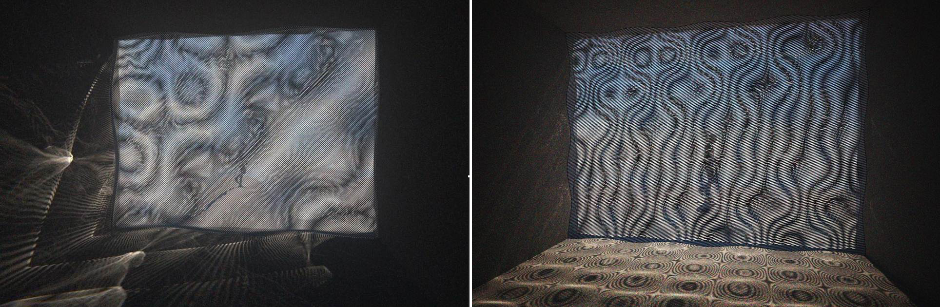
In fact at some point in the process, we decide to apply the graphics directly onto the glass. Using dots or lines, onto the textured glass, with similar, symmetrical or opposite glass pattern, will create to even stronger moiré pattern than the transparent pattern, we had played with in Capiton phase 1.
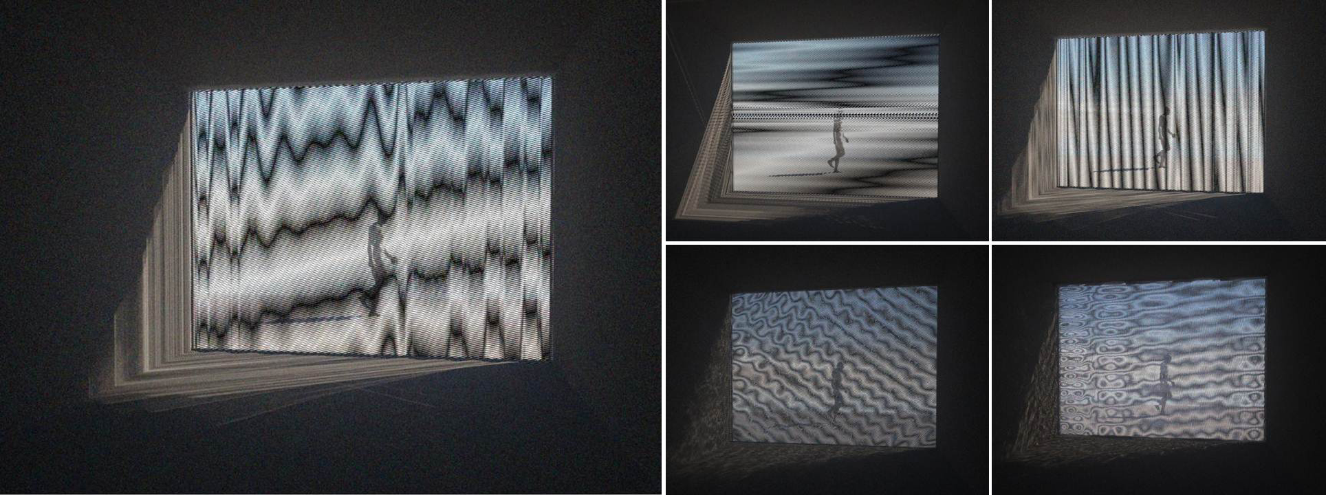

The results are quite surprising; the network of lines for instance will either enhance the shape of the glass or make it disappear because of the weight of the graphic moiré itself.
A slight rotation of a network of line upon another one will totally change its appearance making the overall piece either soft and smooth or very intense and almost unbearable to look at.
The field of play seems to be very wide. We only started to test some very crude graphics, line and dots, straight lines with only one thickness and dots on a grid.
It is clear that there is a great potential to find some subtle interplay between graphic and texture of the glass. At the end, we hope to find “new transparent arrangements” which are more subtle and lively than only transparent.
These arrangements would hopefully include as much properties of the glass as possible and reveal it materiality.

There is a clear link to the serie of pictures taken on the canal Saint Martin (see post Ripple-Code). Actually without this ongoing work on the Capiton, the pattern at the surface of the canal would not have been visible to me. And in return what a better expression of fluidity than this constant movement and variation of light on the glass intertwined with the moiré of line ?