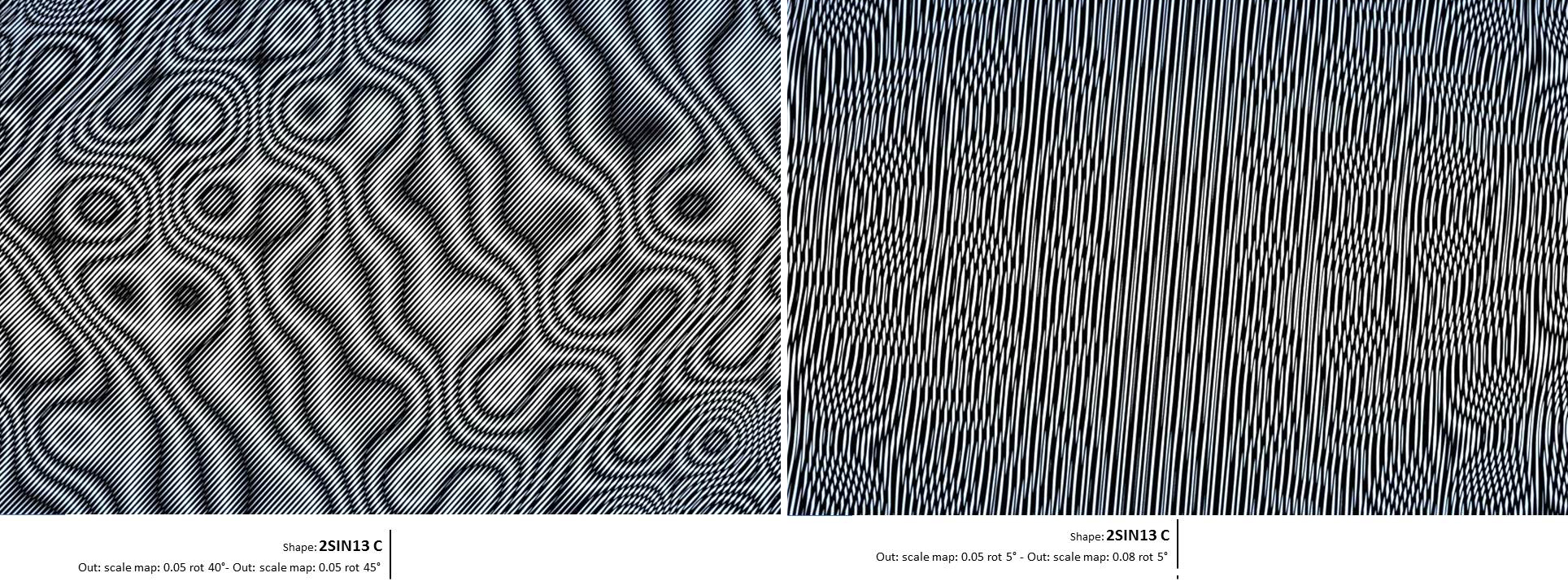
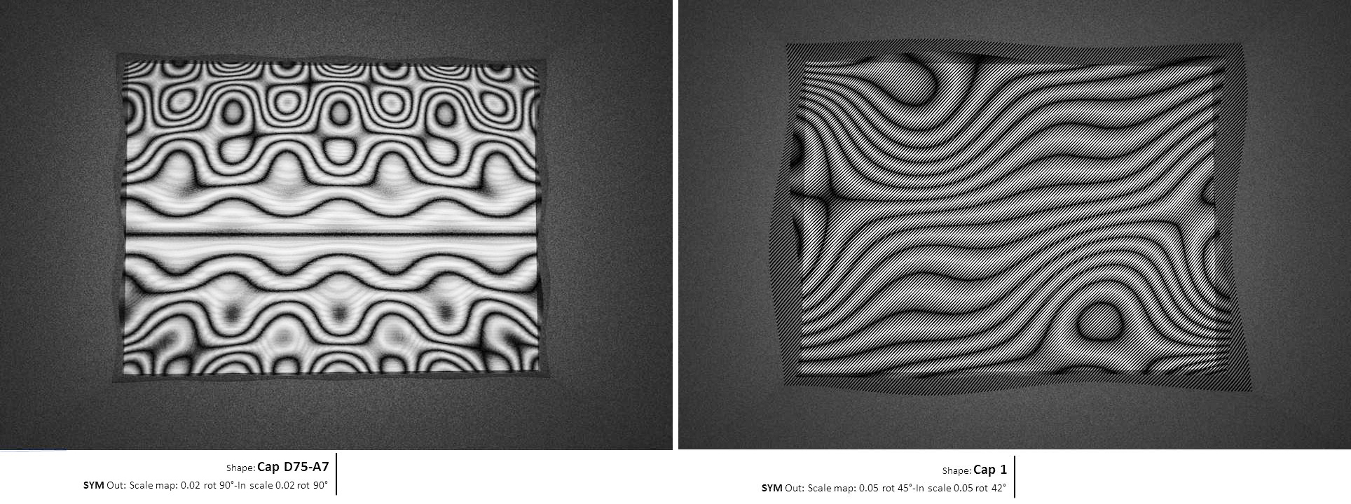
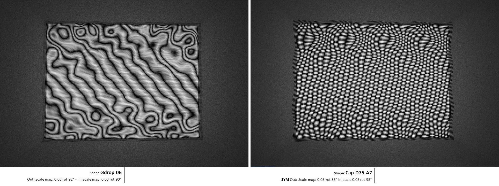
Phase 3 of the Capiton research was geared toward fabrication. Our goal was to make at least some samples and even better an installation. We had found several directions to explore and take advantage of. We needed to finalize the development of the scripts, the simulation and converge on one or two propositions of installation that would be in line with a glass production, mold machining …ect in short get real.
This process has nothing exceptional but describing it might be inspirational for some readers and for us, it is a good way to think back at what and how things got done? This work was done between 2011 and 2015.
The project, an installation
Considering the work done on the previous phase, we decided to concentrate on the simplest principle of capiton with lines over 2 glass surfaces with a slight distance to make a Moiré. We liked the idea of making something at the limit of dizziness, if it was beautiful.
Glass is stable but not the people watching it, neither the sun and shadows or the trees and vegetation around. If the piece has embedded into it enough “variation” potential through its form and some graphic treatment, we might be able to revel or emulate the “liquidity” of glass and also make it seem to be alive instead of trying to make it disappear!.
This glass had to be sensual, tactile, and intense visually, with an elaborate and elegant apprehension of the transparence.
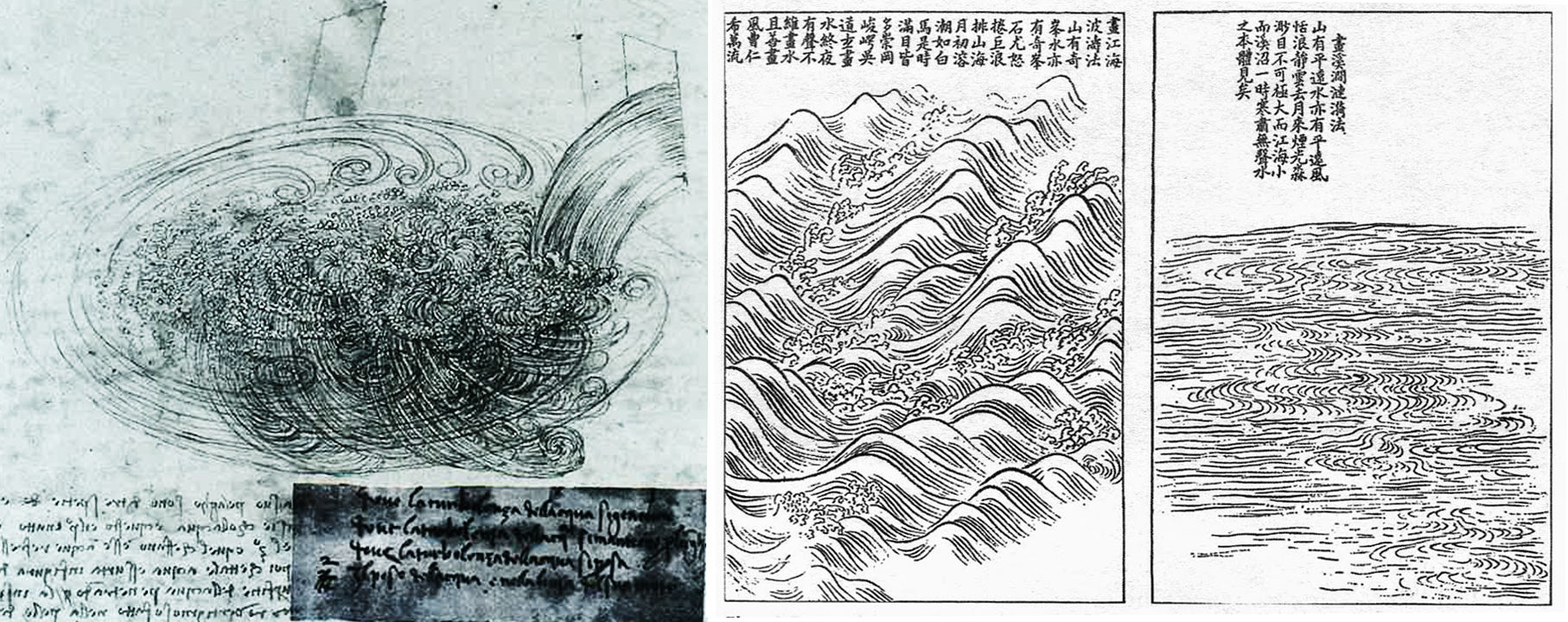
As Philipp Ball, in the second book of his trilogy, Nature’s patterns[1], very few representation of water and its movement can be found in art history, apart and may be the most noticeable studies of the Leonardo Da Vinci, sketches, which are almost as much representation as an attempt to understand the forces in action, or the Asian tradition of water representation [2] [3].
We were not trying to represent the flow, but to be inspired by it. The piece is called “Eddies”, which is defined as follow: “A current, as of water or air, moving contrary to the direction of the main current, especially in a circular motion.”
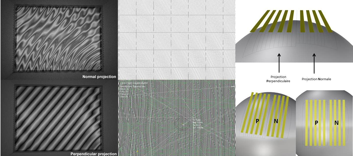
The principle of the piece is simple, 2 pieces of glass facing each other. Each pane is textured. Prior to forming, the glass is etched with vertical lines with varying width gradually toward the center. The distance and the texture between the glass panes only create the moiré effect. There are no additional scaling or rotation of the lines.
Glass forming and samples
The first samples were done by placing high points at the bottom of the owen, and let the glass sag, not very far from what we were doing digitaly. The goal was to determine the maximum height, depending on the amplitude, making sure the glass did not get marked.
Graphic interface
This simplicity is apparent and choosing the texture, the graphic pattern, the size, repartition, orientation materiality of the graphics, the spacing of the pane, the way to hold the glass as lightly as possible, was long process .
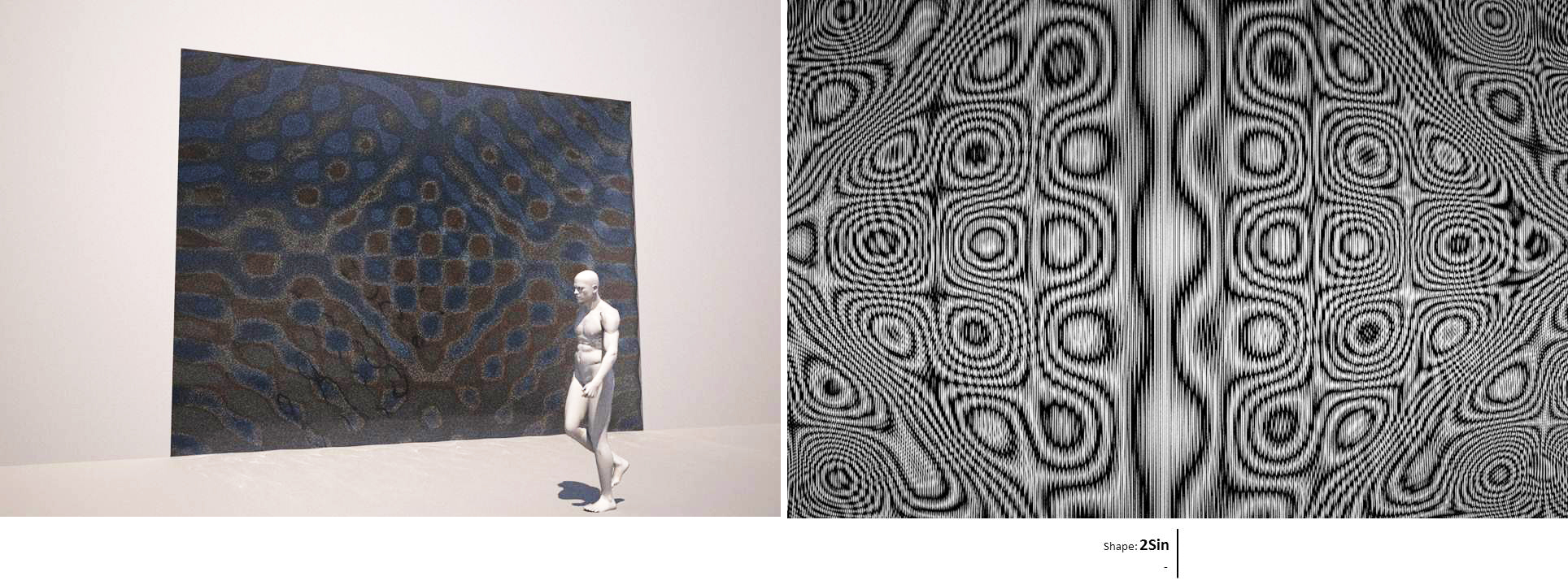
As with any project, we did numerous tests, and then made some choices, left many opportunities on the side. The following images show some of them.
We constantly tried to avoid randomness in the definition of the texture and the graphic, to give a frame, a “structure”, a rational composition to tame the graphic and optic explosion that the distortion and moiré combine with light will release anyway.
In other words, glass and light have such a potential to create variability and apparently chaotic behavior, more other if you use form, superposition of several panes of glass, overlaid graphic treatment, that containing it introduce a counterpoint. The dialogue between the two, structure and wild optic phenomenon, is one of the key points of this work.
The potential of this type of “play” with glass is great and we explored just a few parameters. To make subtle and elegant glass composition, It requires to be able to model and to simulate at best the behavior of the glass; then to analyze the results; take some distance; do some more physical model, come back to the image. To establish a “trust” in the render output, measurement of the glass properties might be required, and a calibration of the model with real samples is necessary as it is with a structural calculation.
On the contrary of what most people think, realistic rendering is not easy at all and is far from being a closed field. In 99% of cases, rendering are very very wrong when it comes to glass, they “represent”, they don’t give an accurate output, even with software that pretend to be physical calculation except with Ocean, which highly recommend. One has to choose between flexibility and easiness of work but poor output and very good output but a more elaborate process which involve to find the right data or to do specific measurement which is often not what one want to do in early stage when nothing is defined yet.
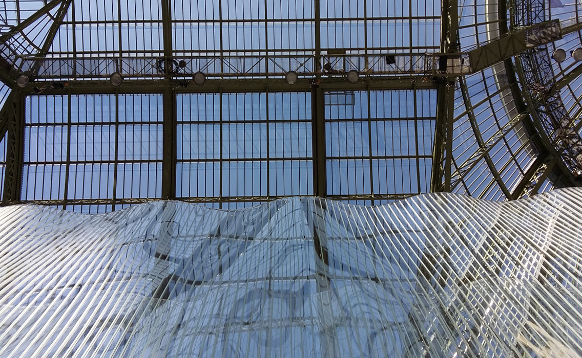
Actually the work on the materiality has just begun and we have found many little adjustments or improvement to be done from the installed piece [4]
Choosing the texture was easy. The criteria was that it needed to have some texture with a somewhat regular parttern. We choose one in the interference area of the wave generated by two “drops”.
Calibration of the lines
The question of the “lines” was more of an issue. Typically, the architectural demand is smaller smaller smaller when it comes to pattern or joint, as it is bigger bigger bigger when it comes to everything else.
At a distance, a pattern of dots or lines if they are small will blend one into another, and create a veil effect, as a constant surface, as if there were no pattern.
This is good when one want the dots or lines to disappear which is usually the case, but here we wanted not only to see the lines but also to have them to do a moiré. The boundary between when we still distinguish the graphic and when it disappears, is actually quite subtle.
Here we define a size of lines that can be perceived easily for a few meter (5 to 10 m) and which keeps to the moiré a real presence. If the line is too small, it looks more like a mistake. The prototype helped us to be confident with the sizes and gave us a first feed back on the materiality of the lines
Gradient , variable transparency, and moiré
Then there is the density of line, we decided to do a gradient, varying spacing and line thickness. J. Raynaud wrote a script to control very finely the opacity and density of the lines.
Fabrication – Installation
We worked closely with Emmanuel Barrois. As he was doing samples, to test his oven, the molds, define the heat curves, giving us result of deformation, we were calibrating our models to be closer to reality. This back and forth was necessary to define what was possible, physically, economically, but also to understand the optical phenomenon which takes place between these two pieces of glass.
Then once, we agreed on what could and should be done, the first panels were run with some results as expected, and amazingly (to me) constant geometry piece after piece. The edges of the panel were scanned to compare with the digital model and prepare the file to machine the stiffeners that were glued in the back face of the glass.
I realize what a privilege it is to be able to work this way, to combine quite accurate representation of reality (it could have been better actually) and constant feedback from fabricated samples. When a design decision is done, it is with some quite good tools not only to judge but also to correct or adapt, because most of the process is parametric
What for ?
We hear very often this question“what for” why investing so much time and energy in something so useless.
First of all, because it is an amazing field of play and we are passionate and fascinated not by what we do, but what we find possible to do. And the more we do, the more the field open into new territories.
The second part of the answer completes the first, I am tired to see how poorly glass is used in contemporary architecture, same for natural light. Buildings are more and more not univocal, one liner, communication machine. For a building responding to multiple needs is necessary, but sometime there should be no needs, just some moments of intensity and wonder which reflect and question the complexity of the word we live in.
The team
The Team on the design side had grown, joined for a few month by Nadja Gaudilliere and Oswald Pfeiffer, and soon after by Clement Duroselle, Minh Man Nguyen associates at WAO for the initial work on redefining the way the graphics could be applied on glass and making the script to generate the surface more efficiently. This parametric approach enables us to generate any iteration.
On the fabrication side, we team up with Emmanuel Barrois “Verrier” art glass fabricator and creator whom I had met through some projects at RFR and with whom I share many ideas about glass making. Emmanuel was assisted by Yvan Delettre, who run the project on AEB side. Emmanuel is much more than a maker, he brings with him all his knowledge about glass, his wit and sensibility.
AEB was planning to expose in the Salon Revelation [4] and we decided to team up to do an installation together based on the work done on the Capiton 1 and 2. I worked on the design of the installation at all level up to fabrication plan helped by Luca Barglagli and Africa Garcia for structural concept and calculation, not forgetting Jacques Raynaud for many inputs and a few scprit also for the graphics.
[1] [2] Philip Ball, Nature’s Patterns, A tapestry in three parts, Shapes, Flow and Branches, p 5 et 16 leonardian flows, Oxford university press, 2009 ISBN 978-0-19-923797-5
[3] http://philipball.blogspot.fr/2014/07/a-feeling-for-flow.html
[4] Révélation Salon 2015 in the Grand Palais September 9-12 Stand Emmanuel Barrois
